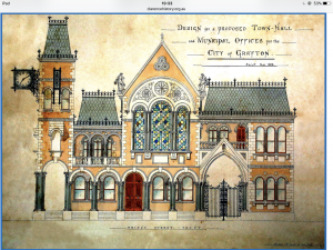
Design for a Proposed Town Hall and Municipal Offices for Grafton, New South Wales, May 1886 (architect unknown), courtesy of the Clarence River Historical Society:
Archive for the ‘Architecture’ Category
Page 0 of 2
London life
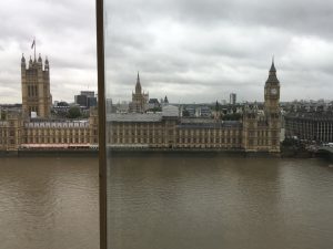
The Houses of Parliament from St Thomas’ Hospital on a rainy mid-week morning.
Czech architects in Japan
For reasons unclear to me, I am interested in the lives of Czech architects who worked in Japan. I welcome additions and corrections to this list.
- Karel Jan Hora (1881-1974)
- Jan Letzel (1880-1925)
- Antonin Raymond (1888-1976)
- Frantisek Sammer (1907-1973)
London life
London Life: Ethereum DevCon1
Gibson Hall, London, venue for DevCon1, 9-13 November 2015. There was some irony in holding a conference to discuss technology developments in blockchains and distributed ledgers in a grand, neo-classical heritage-listed building erected in 1865. At least it was fitting that a technology currently taking the financial world by storm should be debated in what was designed to be a banking hall (for Westminster Bank). The audience was split fairly evenly between dreadlocked libertarians & cryptocurrency enthusiasts and bankers & lawyers in smart suits: cyberpunk meets Gordon Gekko.
Brisbane life
Old Museum Concert Hall.
Paris at Easter
London Life
The Skygarden Bar at 20 Fenchurch Street (aka the Walkie-Talkie Building), London.
Mash-up culture
If one trope could define the full diversity of artistic endeavour in this Millenium period, it is the mash-up. For visual art, we have become used to collages of images, videos, fashion, and even material junk. Ditto for sound objects and events. In movies, Godfrey Reggio’s Koyaanisqatsi (1982) became a popular example, at least among college students. And now computer scientists are exploring mashups of programming languages, for instance, here. But not even architecture has escaped. The increasingly widespread Bauhaus-influenced style seen in new office and apartment buildings in Europe and North America these last two decades is one of life’s great pleasures of looking.
What distinguishes this architecture? The influence of Bauhaus and de Stijl ideas is evident in straight edges, flat roofs, vertical walls, and structures comprising rectangular prisms. But these are not the single-box prisms of the International Style skyscrapers of 50 years ago. Rather, each structure comprises multiple, intersecting prisms, expressing a multiplicity of interpenetrating shapes. The result is that external walls are not flat or simply lying in a single vertical plane, but extruding or withdrawing into multiple vertical planes. The effect of this interleaving mash-up is most pleasing.
Second, external surfaces are no longer a single, uniform colour or material. Typically, the different prisms, or the different interpenetrating vertical planes, will be made from different materials: red-brick, white stone or concrete, grey aluminium sheets, etc. Here, the mash-up of materials and colours is unlike most western domestic or office architecture of the past two centuries.
Here are some examples. First is the red-brick apartment building across the street in this photo, in Madison, Wisconsin (Source: via The Dish). Notice how the external walls do not all lie in the same vertical plane, and note the use of different coloured and perhaps even types of surfaces – red-brick, light-coloured brick, and grey slate. There is a white trim.
And here is the Jaclyn Building, in Sofia Bulgaria (Architects: Aedes Studio), again with red brick, grey and white surfaces, but this time less balanced vertically.
And here is an apartment building, The Reach, in Leeds Street, Liverpool, UK, with all the familiar elements along with a curved corner. The only thing lacking from this building is a single tree in green leaf right up against it, to give the image a textured asymmetry of colour and line.
Visual pleasure
Some buildings and spaces provide pleasure to the eye and heart, and an inexplicable lift to the spirits. One such place is Frank Lloyd Wright’s Unity Temple in Chicago, whose intimacy and proportions are ineffably balanced.
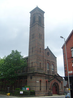
Another is the Italianate Church of St Brigid in Wavertree, Liverpool. This Anglican church was designed by E. A. (Arthur) Heffer and built between 1868 and 1872. The building can be clearly seen from the inter-city trains approaching and departing Liverpool’s Lime Street station, and seeing it never fails to lift my spirits.
Perhaps the pleasure arises from the stark contrast between the tall bell tower and the flat, surrounding landscape of two-story Victorian terraces. Or perhaps it is the shape and size of the tower; certainly, the visual pleasure would be much less if the tower were pyramid-shaped, or conical, or any shorter.
