Grand View Hotel, Cleveland Point, Brisbane, QLD, Australia (established 1851).
Archive for the ‘Places’ Category
Page 6 of 7
London comedy life
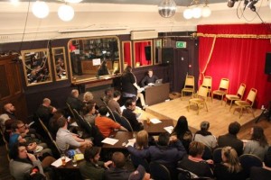
JesterJester’s open-mike nights at the intimate basement home of Betsey Trotwood.
Mash-up culture
If one trope could define the full diversity of artistic endeavour in this Millenium period, it is the mash-up. For visual art, we have become used to collages of images, videos, fashion, and even material junk. Ditto for sound objects and events. In movies, Godfrey Reggio’s Koyaanisqatsi (1982) became a popular example, at least among college students. And now computer scientists are exploring mashups of programming languages, for instance, here. But not even architecture has escaped. The increasingly widespread Bauhaus-influenced style seen in new office and apartment buildings in Europe and North America these last two decades is one of life’s great pleasures of looking.
What distinguishes this architecture? The influence of Bauhaus and de Stijl ideas is evident in straight edges, flat roofs, vertical walls, and structures comprising rectangular prisms. But these are not the single-box prisms of the International Style skyscrapers of 50 years ago. Rather, each structure comprises multiple, intersecting prisms, expressing a multiplicity of interpenetrating shapes. The result is that external walls are not flat or simply lying in a single vertical plane, but extruding or withdrawing into multiple vertical planes. The effect of this interleaving mash-up is most pleasing.
Second, external surfaces are no longer a single, uniform colour or material. Typically, the different prisms, or the different interpenetrating vertical planes, will be made from different materials: red-brick, white stone or concrete, grey aluminium sheets, etc. Here, the mash-up of materials and colours is unlike most western domestic or office architecture of the past two centuries.
Here are some examples. First is the red-brick apartment building across the street in this photo, in Madison, Wisconsin (Source: via The Dish). Notice how the external walls do not all lie in the same vertical plane, and note the use of different coloured and perhaps even types of surfaces – red-brick, light-coloured brick, and grey slate. There is a white trim.
And here is the Jaclyn Building, in Sofia Bulgaria (Architects: Aedes Studio), again with red brick, grey and white surfaces, but this time less balanced vertically.
And here is an apartment building, The Reach, in Leeds Street, Liverpool, UK, with all the familiar elements along with a curved corner. The only thing lacking from this building is a single tree in green leaf right up against it, to give the image a textured asymmetry of colour and line.
London life

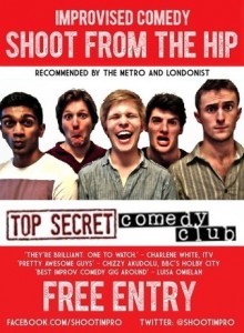
Shoot from the Hip’s Improv Jams and Workshops, London (HT: WP).
London life – WW I
On 22.00 on Monday 4 August 2014, Ryoji Ikeda turned-on an installation of a vertical light at Westminster, entitled Spectra, to commemorate the centenary of the entry of Britain into World War I. The light can be seen from many places elsewhere in central London, appearing to curve over the viewer and ending in a burst of brightness. The effect is ominous and hauntingly beautiful, particularly in the early hours of the morning when alone on the streets.
London Life
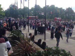
Some of the crowd waiting to see Yemeni-American video stars Adam Saleh and Sheikh Akbar (aka TruestoryASA) in Hyde Park London on Sunday 3 August 2014. The stars were rescued by police. Report here.

London life
London life
Speakers’ Corner, Hyde Park, London.
London life
Scooter Caffe, Lower Marsh Street, Waterloo, London SE1 7AE.
Liverpool life
The Caledonian public house, L8.

